Mel Birnkrant's
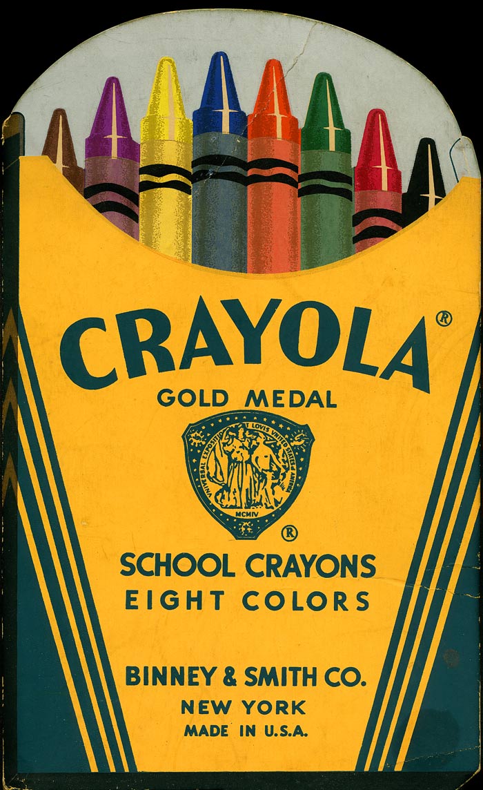
Growing up in the 1940s, the traditional box of Crayola Crayons was a powerful icon. It symbolized to my young eyes, everything that the word, “Art” implied. Each friendly familiar box of Crayola Crayons contained eight waxen wands that enabled even a child my age to conjure up a world of Magic. Red, blue, yellow, orange, purple, brown, and black; these eight basic colors were all a kid required to begin a lifelong journey, along the road to art and life. This 1930 stand-up store display tells the whole story. Throughout the Twentieth Century, Crayola Crayons and their iconic golden yellow and deep green package remained constant, never changing, always reassuringly the same. Like the imposing monument in Stanly Kubrick’s movie, this miniature monolith burned its image into my brain.
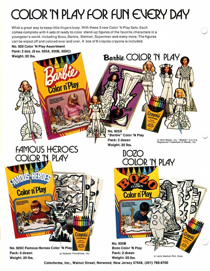
In 1974 Colorforms introduced a line of boxed activities. This was, for once, a logical product for Colorforms to make. These new activities would sit on the shelves of toy stores, next to the Colorforms standard “Stick-On” sets, and thus, increase the company’s allotted space in the activity aisle. It was up to me to come up with the contents, as well as the packaging design of this new line. One resulting product was called "Color n’ Play." Color n' Play activity sets combined the fun of coloring with stand-up figures that a child could play with, after the coloring was done.
Up till that time, most coloring activities contained low quality generic crayons. Harry and I both insisted that, even though, cheap no-brand crayons would be more cost effective, Colorforms had to use the very best: genuine “Crayola" crayons.
In 1974 Binny and Smith, the Crayola company, was, as Harry might have put it, “asleep at the wheel.” For three quarters of a century Binny and Smith had never attempted to produce a series of activities, under their Crayola brand name, or make use of their own unique look. When Colorforms introduced Color n’ Play, we woke a sleeping giant, who, before the year was over, let out a resounding scream! But, for now, I designed the entire package of Colorform’s Color n’ Play to take on the look of a big box of "Crayola Crayons." My original comp packages can be seen below.

This page from Colorform’s Catalogue shows how the finished product appeared.

Sometime, in the year that followed, Binny and Smith finally woke up to the fact that Colorforms had produced a product and a package that Crayola, themselves, should have done. So, they sent us a legal notice, warning that if we didn’t stop using diagonal Crayola-like lines on our product, they’d take our crayons away. From every angle, it was clear that we had to change the package. There were other issues too. We soon discovered that the crayons weren't such high quality, after all. They smeared and rubbed off easily. Therefore, we changed the product’s name to “Color and Re-color,” and, thereby, turned its biggest fault into a feature. Thus,“Color n’ Play” underwent a radical transformation. The results of our efforts to turn lemons into lemonade, appear below!
The following year, Binny and Smith introduced their own line of coloring activities. And the packages made use of diagonal stripes, and the classic Crayola shades of yellow and green.
Now, fast forward several years to the time that Kiscom, the sons of Colorforms, and I were attempting to sell toy ideas. By then, Binny and Smith had been purchased by Hallmark. Meanwhile, the company had continued to expand their line by introducing new activities. My partners, Adam and Andy Kislevitz and I decided that showing them some product concepts was worth a try.
Now, fast forward several years to the time that Kiscom, the sons of Colorforms, and I were attempting to sell toy ideas. By then, Binny and Smith had been purchased by Hallmark. Meanwhile, the company had continued to expand their line by introducing new activities. My partners, Adam and Andy Kislevitz and I decided that showing them some product concepts was worth a try.
We agreed that I should not spend a lot of time on these, as we realized that basing products on the distinctive Crayola look restricted us to just one customer, Binny and Smith. Therefore, I invested just two days work into these drawings. I always liked them. They were to the point, simple, and clean. In the best of all possible worlds, there should have been a “Mr. Crayon.”
The premise was based on my unflagging tendency to personify everything. I had attempted to do the same with the Colorforms clown logo, and use it’s styling as a theme that ran through the entire line. The image was becoming a fixture in Colorform’s marketing. Nonetheless, when I left the company, they let it die.
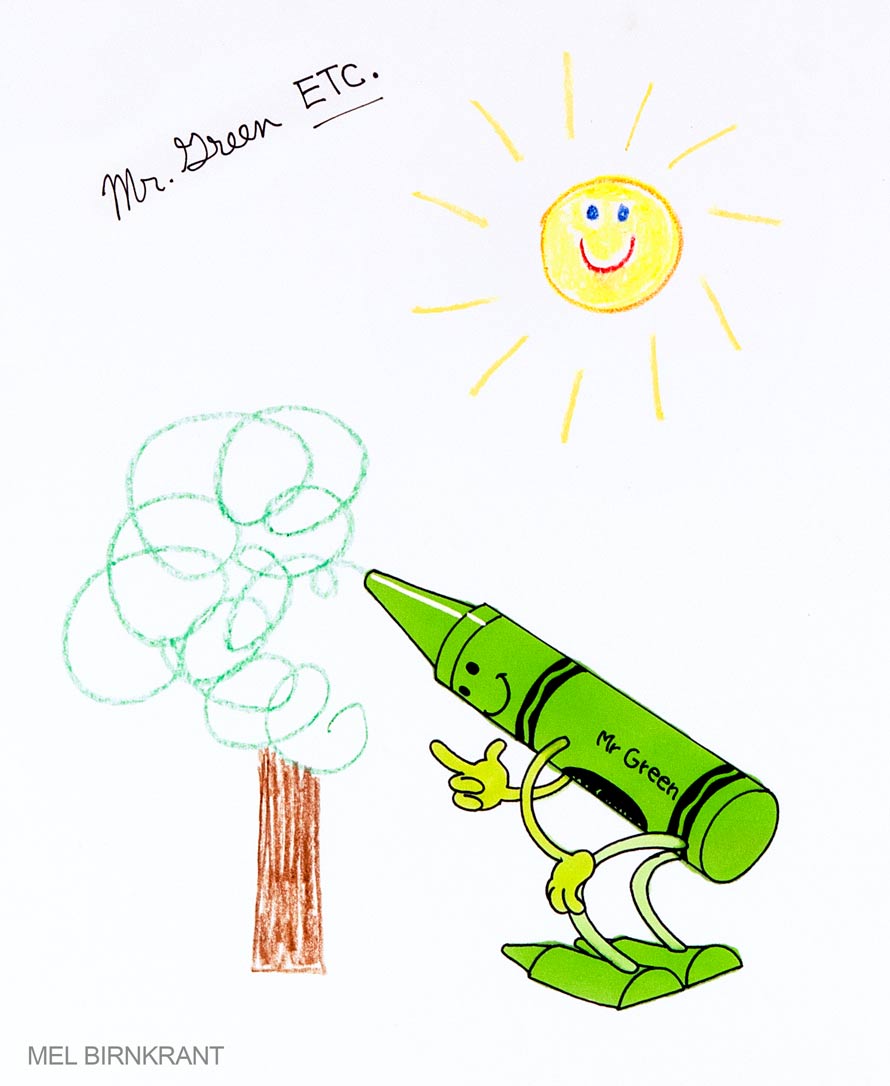
This, of course, was also in the tradition of such all-time favorites as Mr. Peanut. And for that matter “The Weenies!” And so, from the guy who tried to bring you the Weenies, here he is! Meet Mr. Crayon. The main image would have used the basic Crayola colors, but could also be applied, again and again, to every crayon, as in this instance, “Mr. Green.”
The premise was based on my unflagging tendency to personify everything. I had attempted to do the same with the Colorforms clown logo, and use it’s styling as a theme that ran through the entire line. The image was becoming a fixture in Colorform’s marketing. Nonetheless, when I left the company, they let it die.
This, of course, was also in the tradition of such all-time favorites as Mr. Peanut. And for that matter “The Weenies!” And so, from the guy who tried to bring you the Weenies, here he is! Meet Mr. Crayon. The main image would have used the basic Crayola colors, but could also be applied, again and again, to every crayon, as in this instance, “Mr. Green.”

The line would, essentially, consist of various devices to store and carry actual Crayola Crayons. In some cases, these would be standard sized crayons. In other applications, the crayons might be the large oversized ones, used in kindergartens. I remember those big fat Crayola Crayons, from a time when I was small. Thus, some of these toys might come in two sizes, depending on the size of the crayons.
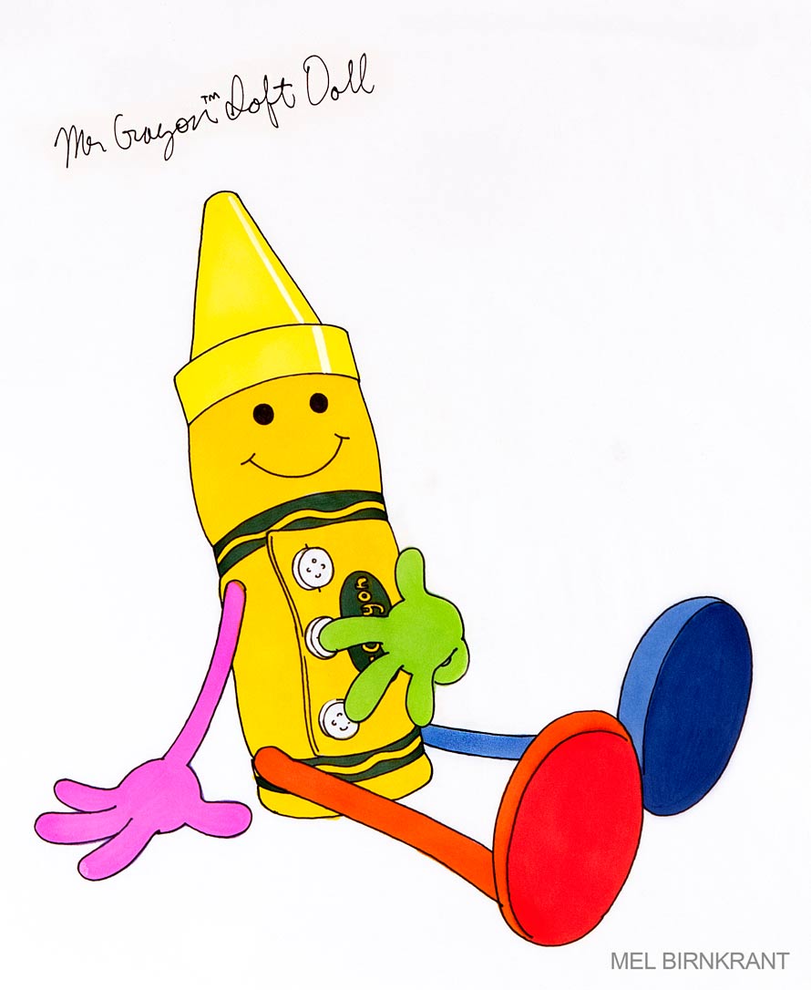
The signature product would be a sort of doll, or figure, of Mr. Crayon that opened up to reveal a secret cache of crayons. The variations on this concept were virtually endless. Here, Mr. Crayon removes his hat to reveal the crayons inside. There might also be a special run of crayons, designed with faces on their labels.
The signature product would be a sort of doll, or figure, of Mr. Crayon that opened up to reveal a secret cache of crayons. The variations on this concept were virtually endless. Here, Mr. Crayon removes his hat to reveal the crayons inside. There might also be a special run of crayons, designed with faces on their labels.


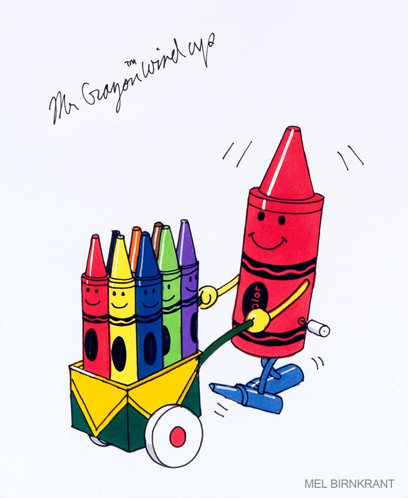
When I was a kid, I recall loving a whole series of playthings that came with crayons inside them. There were many variations of this concept, like this charming paper wagon, pulled by a mother cat with a kitty cart of crayons, behind. This was made by Transogram. It dates from 1936, one year before I was born.

Here, I adapted the above concept to envision a Crayon Caliope, driven by Mr. Crayon. As the vehicle rolls along, it plays a song, and the crayons move up and down.

This one is a windup variation.
And this is a variation of the doll. It would, perhaps, be most effective with the larger crayons.

I like this soft doll variation. Again, the larger crayons will allow this to be bigger, and the crayons more unique and easier to play with for little kids.

Last of all, this drawing toy projects an outline on a sheet of paper. Years before this, the Batman Shadow light proved that just a clear flashlight bulb and an image on a piece of film will cast a surprisingly clear image. This could also be more complicated with lenses added.

Unfortunately, Crayola was not the least bit interested. And knowing what static we would get from Binny and Smith if we tried to use their diagonal stripes for anyone but them, there was no place else to go with this. Nonetheless, I thought the drawings were fresh and nice, even though the effort proved to be a waste of time. I soon forgot about this concept, until I came across the drawings, just the other day. Now, that these images are launched upon the internet, the presentation boards can be put away, never to be seen again.
All Original Written and Photographic content is Copyright MEL BIRNKRANT